Our name
“EPFL” is the primary and stand-alone name that refers to our school. The explanatory line “École polytechnique fédérale de Lausanne” is there only to explain the signification and abbreviation of the four letters (comparable to “Massachusetts Institute of Technology”)
When introducing the primary brand “EPFL” for the first time in a text it is followed by its explanatory line in the language of the targeted audience.
Links
Logo
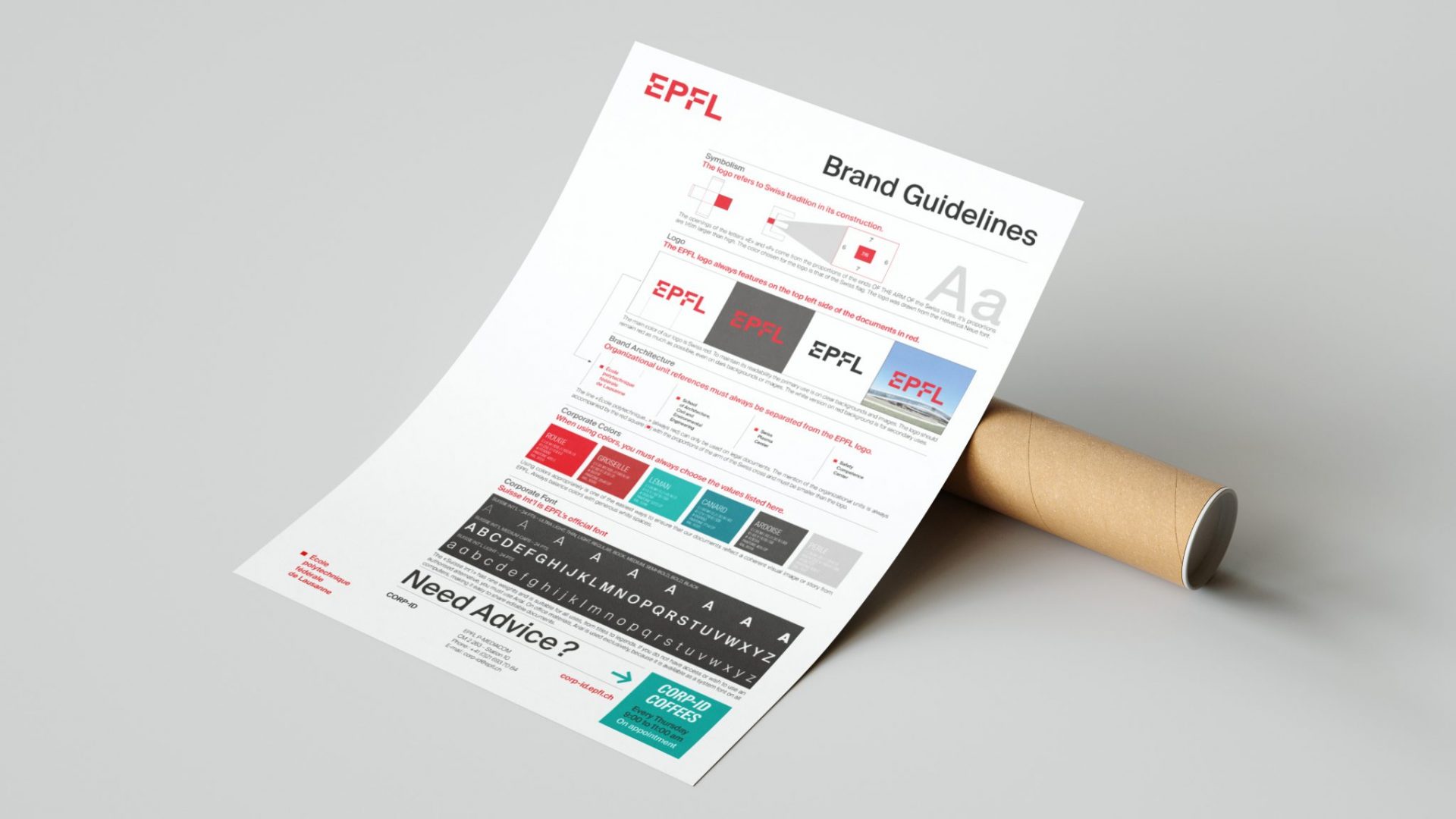
Simple and sophisticated at the same time, the new logo focuses on the four EPFL letters, and the red color to symbolize Switzerland. It acts as a signature, an identifier and a guarantee of quality. The openings of the letters “E” and “F” come from the proportions of the ends of the arm of the Swiss cross.
The EPFL logo, as shown here, is the main campus logo and a registered trademark. It should never be modified or compounded. It is available to the entire EPFL community.
For any use by people outside EPFL, please contact Mediacom visual communication and specify the purpose of your request.
Typography
Official EPFL font is Suisse Int’l. Font is used for the logos and prescriptors of the organizational units. EPFL generally uses only Light and Medium styles, as well as their italics.
If you don’t have access to Suisse Int’l or if you need a solution that is compatible with all systems, you can replace it with Arial.
Its use is subject to licence. It is made available to employees via Distrilog.